LaTeX, three packages for one document
LaTeX, three packages for one document
The standard version of LaTeX has a “state of the art” typographic quality, suitable for any type of document.
For those who want to try different typographical solutions it is, however, possible to use packages that modify the basic settings.
The result may be more or less preferable to the standard version but it is, however, interesting to make some comparative tests.
In this article I compare the title page of an agreement document in the standard version, in the version named koma-script and in the further version named ArsClassica.
At the end of every paragraph I report the relative preambles used for the generation of every version.
The images of the three title pages were framed with the open-source software Digikam.
LaTeX in standard version
Below I report the title page of a agreement written in standard LaTeX
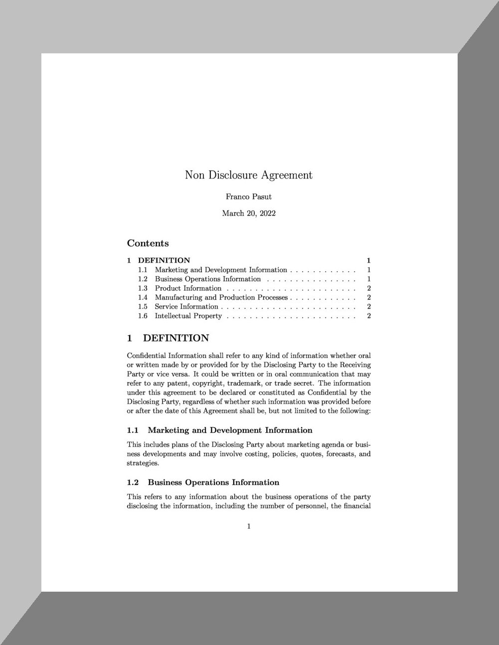
The page layout is elegant, well-kept and well-proportioned: perfectly suited to the formal rigor of legal document.
Following is the relative preamble:
\documentclass[11pt]{article}
\usepackage[utf8]{inputenc}
\usepackage[T1]{fontenc}
\usepackage{graphicx}
\usepackage{grffile}
\usepackage{longtable}
\usepackage{wrapfig}
\usepackage{rotating}
\usepackage[normalem]{ulem}
\usepackage{amsmath}
\usepackage{textcomp}
\usepackage{amssymb}
\usepackage{capt-of}
\author{Franco Pasut}
\date{\today}
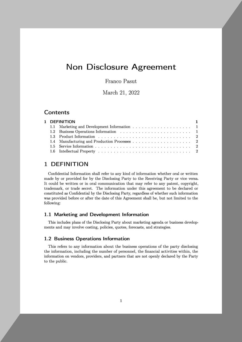
LaTeX in koma-script version
This is, instead, the version with the “koma-script” package: the text of the sections is more rounded and, consequently, they “detach” better from the base text.
A feature of this solution is the possibility to use font sizes larger than 12 pt.
Below is the related preamble:
\documentclass[12pt,a4paper]{scrartcl}
\usepackage[a4paper,top=2cm,bottom=3cm,left=2.5cm,right=2.5cm]{geometry}
\usepackage[T1]{fontenc}
\usepackage[utf8]{inputenc}
\usepackage{indentfirst}
\usepackage{paralist}
\usepackage{microtype}
\usepackage{amsmath}
\usepackage{amsfonts}
\usepackage{amssymb}
\usepackage[official]{eurosym}
\usepackage{booktabs}
\usepackage{caption}
\usepackage{enumitem}
\usepackage{comment}
\usepackage{etoolbox}
\author{Franco Pasut}
\date{\today}
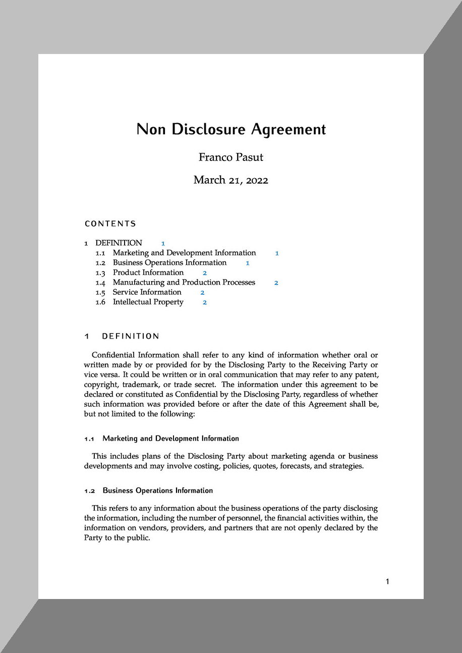
LaTeX in ArsClassica version
Finally, here is the ArsClassica version: extremely elegant, with the text of the current section at the top right (in this case it says “Index” because it is at the beginning of the document).
The separation between the text of the sections and the basic text is very clear.
Hypertext references are highlighted with a blue color that does not create problems in black and white printing but remains visible in the online version.
Here is the related preamble:
\documentclass[fontsize=12pt]{scrartcl}
\usepackage[eulerchapternumbers,beramono,pdfspacing]{classicthesis} \usepackage{arsclassica}
\usepackage[a4paper,top=2cm,bottom=2.5cm,left=2.5cm,right=2.5cm]{geometry}
\usepackage[T1]{fontenc}
\usepackage[utf8]{inputenc}
\usepackage{indentfirst}
\usepackage{paralist}
\usepackage{microtype}
\usepackage{amsmath}
\usepackage{amsfonts}
\usepackage{amssymb}
\usepackage{booktabs}
\usepackage{caption}
\usepackage{enumitem}
\usepackage{comment}
\usepackage{etoolbox}
\usepackage{hyperref}
\author{Franco Pasut}
\date{\today}
Thank you for your attention.